Murphy’s Dictionary

What would you get if you married Ambrose Bierce’s Devil’s Dictionary

CYNIC, n.

A blackguard whose faulty vision sees things as they are, not as they ought to be. Hence the custom among the Scythians of plucking out a cynic’s eyes to improve his vision.

…with the engineering adage Murphy’s Law

If there’s more than one possible outcome of a job or task, and one of those outcomes will result in disaster or an undesirable consequence, then somebody will do it that way.

…?

Murphy’s Dictionary: an ongoing series of definitions of what words really mean on a typical development project.

Code Is Not Enough

So you’re a coding ace. You know the latest languages. You use the latest tools. You even write your own tools, so your development environment practically reads your mind. You eat, sleep, and breathe code.

So why do you keep missing your deadlines? Code is not enough.

You love to code. You can hardly believe that people pay you to “work” at a hobby you often do for no pay at all. You’re never without a few personal projects under development.

So why do you feel so stressed at work? Code is not enough.

Code may be the fun part of programming, but it’s only a small part of the development process. It’s not enough to see you through a tough project. It’s not enough to help you develop business and meet requirements. It’s not enough to make your project a success.

Code is not enough. And in these essays, I’ll discuss the rest of the development process.

Project metrics they never taught you in Project Manager training

Project management involves lots of metrics: data you gather, measure, and analyze to assess and predict the state of your project. But I find some of the most useful project metrics are often overlooked. Here are a few to add to your toolbox.

WSR (Work-to-Sleep Ratio)

This is a measure of how likely your team members are to make mistakes at crucial moments. If their WSR for the week is 1 or less, they’re probably bored. 1.25 or even 1.5 are signs of a team moving at a good pace. Higher than that, though, can be a problem. 2 is about the limit for a typical team member, and they probably can’t keep that up. Rare individuals can maintain a WSR of 3 for a time.
At one point last year, my WSR was 7.5. That’s just not good.

DODO (Days On per Day Off)

Often correlates with the WSR, and serves as another measure for the likelihood of mistakes. 2.5 is a normal work week; but honestly, how many of you work normal work weeks? 6 is a common work week for projects in a crunch. A monthly average of 13 or more is a sign that your team members may soon be tied up in family counseling or divorce court.

HBT (Handbasket Temperature)

“It’s getting kinda warm in this handbasket. I wonder where we’re going in it?” Although this can be hard to measure, your team members probably have opinions on what the HBT is. If they all think it’s getting hot, maybe you need to ask where your project’s going.

GALB (Going-Away-Lunch Budget)

Every team has transitions. That’s normal. But watch your budget for going-away lunches. If it starts to grow, that’s because the rats are deserting the sinking shipthe team members find other opportunities more appealing.

Related to this is GAAB: the Going-Away-Alcohol Budget. If your team has some drinks at the going-away lunch, that could simply be because it gives them an excuse to drink during the day. But if the bar bill starts to exceed the food bill, it’s probably because the ones who haven’t found escape hatchesnew opportunities yet are drowning their sorrowscelebrating the good fortune of their former coworkers.

Dilbert Barometer

Credit for this one goes to Scott Adams, creator of Dilbert. (Well, OK, he’ll take cash or check, too.)

As Mr. Adams explained in an email I lost sometime last century, the Dilbert Barometer is a rather non-linear scale, where both extremes are bad.

If the programmers are papering their cubicles with old Dilbert strips, that’s a sign that they’re troubled. Even worse is when they don’t just put up any old strips, only selected strips that happen to reflect what’s going on in your organization. That means they’re making judgments and a statement about the pointy-haired bosses at your company. (At one time, three walls of my cubicle at one job were Dilbert strips from top to bottom.)

But if there are no Dilbert strips anywhere, that means your organization is a rigid, humorless police state. All the people with talent and ambition (and humor) will leave. All that will be left will be those who have Abandoned All Hope. And since hope is the primary energy source for many projects, that’s not a good thing.

A healthy Dilbert Barometer measures somewhere from one to ten Dilbert strips per team member. (Mr. Adams would be glad to sell them to you.) It’s also healthy if the team members have scratched out the names in the strips and written in the names of their coworkers. That shows your team knows how to laugh. And that leads us to…

The Laugh Meter

Productive, successful teams are happy. They form a bond of shared experiences. They take time out to share ideas. They laugh.

Worried, stressed teams are unhappy. Their humor ranges from grim to none. They only talk about work, and mostly about problems. If you don’t hear a few good laughs in a typical work day, your people have lost the energy they’ll need to get through the project.

On the other hand, if your people giggle uncontrollably with little or no provocation, check their WSR. When it gets up to 3 or so, uncontrollable fits of laughter are a common symptom.

And-every-single-one-of-them-is-right!

So one time, I showed a friend a Web site for a project I was working on. And he asked an interesting question:

Well, you’re design guy right? Shouldn’t you be writing a design document?

And what I suddenly realized was unclear was that the Web site was a design document. It was just a design document of a very different sort. It was basically a step one design document, serving as a way to put the ideas in a concrete form for discussion. The team kinda knew what the product should do, but not every last detail yet. Some team members were ready to jump in and start coding right away, and just call it Agile Development if we needed to justify the work. Instead we said, “Wait a minute. We have a vision, but no details. If we don’t explore what some of the users will demand from the system, we won’t design the architecture to accommodate them properly. So before we can write a line of code, we need to explore what a range of users need. Then we can design an extensible architecture that should support most of those needs. And then we can jump in and start coding.” So the Web site was, in part, a format for exploring what different sorts of users would want, by telling stories of how they would use the system. And since the system was intended to be marketed to users who could use those same stories as a way to envision using the system themselves, it made sense to document those stories in a marketing-oriented Web site. But marketing-oriented or not, the Web site still served a purpose as a design document.
Now my friend would never be so rigid and unimaginative as to say that the Web site wasn’t a design document; but I have met people who are so wedded to hidebound procedures that they would have argued exactly that, just because it didn’t conform to some formally defined design document template or fit into some formally defined design methodology. And that reminded me of Kipling:

“There are nine and sixty ways of constructing tribal lays,
“And-every-single-one-of-them-is-right!”

Design is a heuristic problem, meaning that there are techniques that can lead to a solution, but no single guaranteed and inviolable path to a solution. Quoting from Wikipedia:

In computer science, a heuristic is a technique designed to solve a problem that ignores whether the solution can be proven to be correct, but which usually produces a good solution or solves a simpler problem that contains or intersects with the solution of the more complex problem.

Note the word “usually” in that description. Some heuristics are better than others, but none can be proven to be right, especially not in the general case.
There are many ways to design, because design is really just a means of communicating and refining your ideas. Different people communicate better in different fashions. Some people are more visual, and some or more verbal. Some are more instinctive, and some are more methodical. Some are more detailed, and some have a broader view. And so there’s no one right way to communicate a design to other team members and stakeholders. The only “right” approach is multiple approaches, to ensure that you cover the same material in different ways to gain different perspectives.
As an example, some people love written design docs, and just can’t see any benefit in design diagrams. Others believe in making excruciatingly detailed UML diagrams, and sometimes see those as “complete” designs. Now I’m pretty fanatical about using UML for my designs; but when I teach UML, I always point out that neither text nor pictures is sufficient. You need both. Different people and different teams will emphasize one over the other, but you need both.
That doesn’t mean that there aren’t better ways and worse ways to design. I would never consider a marketing-oriented Web site to be a complete design, just a step in building the design. But when we built that Web site, we were definitely participating in a design effort. Because…

“There are nine and sixty ways of constructing tribal lays,
“And-every-single-one-of-them-is-right!”

The Echo Effect

The primary conundrum in requirements analysis is simple: how can you be sure that you understand what the user said or wrote? Analysts have to master the terminology and domain of the customers. Only customers can verify that analysts have done so. This is made more difficult by many forces:

  • The difficulty of learning a new domain and new terminology.
  • The slippery nature of language.
  • Overloaded language: you understand the words they’re using, but not the domain-specific way in which they’re using those words.
  • Illusions of understanding. Misunderstandings often arise when participants only think they agree on something; and then they realize their disagreement only after a lot of time has been committed to the wrong solution.
  • The customer’s hyper-familiarity: familiarity to the point where the domain is just a background, an unseen and unspoken given.
  • Too much information. This can lead to lost information.
  • Impatience and schedule pressure. These push people to declare understanding before it’s really reached.

The answer to these forces is The Echo Effect: ensure that analysts restate the requirements to the customers, but not in the same words the customers used. Polish up the artifacts you created as part of The Outline Effect, and present those to the customer as an Echo.

Early on, the goal is not to be right, but rather to be wrong in interesting, illuminative ways. Oh, it’s nice to feel like a genius when you do get it right the first time; but that’s rare. Much more common is that you think that you got it right, because your customer nods and doesn’t say much, when what’s really happening is that he’s too busy and just wants this meeting to be over. So being “right” in your early Echoes can lead to a false sense of security; and trying too hard to be right right away is misplaced effort and worry. Be as correct as you can manage, but recognize the limitations of your current knowledge. (See also The “Martin the Moron” Effect.)

And when users tell you that you’re wrong, get them to explain why. This will reveal hidden knowledge and assumptions, and is the real goal of The Echo Effect. When users tell you that they don’t understand your restatements, restate again in different ways.

You can also apply The Echo Effect within the team, before you take your Outline to your customer, as a way of reaching a common understanding of your requirements.

The act of translation in The Outline Effect helps you to form a concept of the requirements, and then the communication of The Echo Effect highlights misconceptions. Requirements elicitation is a loop, not a pipeline. These two effects together form the core of any good requirements analysis process.

And sometimes, they can really make you look good! After one long requirements session with me and a large number of users, we sat back and looked at the resulting UML diagrams. One user asked, “You just got here, and you’ve got a better picture than we do. How can you know all that?” And I answered, “I don’t know it. I have to go study these pictures still, so I can start to learn it. You know some of it, and she knows some, and he knows some. You all know all of it, when we put you all together, and I still don’t know hardly any of it. All I know is how to ask the questions and then draw the pictures of your answers.”

See also Joel Spolsky’s User Interface Design for Programmers. His discussion on mental models is a good argument for The Echo Effect. He explains how the end user and the developer each have a mental model of how the system works; and when those two models are closely aligned, the result is great software. But without The Echo Effect, it’s impossible to recognize when the models are misaligned. (He also argues that it’s far easier to move the developer’s model toward the end user’s than vice versa. Sorry, but that’s just the way it is.)

The Outline Effect

And as long as I’m posting UML tips to get you ready for the case study, there are two other analysis effects you should strive for. The first of these is The Outline Effect.

It’s difficult to learn a new domain. Analysts have to constantly learn new domains and requirements. They’re always learning and studying. How can they better focus on the information that they gather and draw knowledge from it? Some teams work in the same domain from project to project, but many teams tackle a new domain with every project. And even within a single domain, technology and end-user needs are constantly changing. Very few teams can coast through a project relying only on what they knew in the past.

Forces that contribute to this problem include:

  • Many new facts to comprehend. The first thing you have to learn is roughly how many things there are to learn.
  • Passive learning (i.e., reading and listening) is less effective than active learning.
  • Too much information. This can lead to lost information.

An extremely powerful answer to these forces is The Outline Effect: require analysts to create an Outline of the problem domain and the problem. Don’t just read, Outline! Now, I use “Outline” in a general sense. They might create an actual outline; but they might also create a UML model, or they might restate the requirements in a different form from how the customer presented them. Obviously, I’m a fan of UML models as Outlines; but regardless of the specific approach, the goal is to restate and reformulate the requirements in your own words and pictures.

Research shows that active learning fixes lessons in the brain more thoroughly. Reformulating the requirements involves more of the brain than does passive review. Reading a document requires you to process words in the language centers of your brain, but not much more – and even less, when the material gets dry and you start to get drowsy. Outlining a document, on the other hand, forces you to move the material into your forebrain, so that you can think about how you want to restate what you read; and then you have to push the knowledge back through the language centers and other “creative” parts of your brain to create the restatement. Heck, even your motor centers have to be involved, since you have to write or type or draw (or even sculpt) to create the restatement.

And more brain leads to better analysis, which is the point of this blog, of course. Not only do you apply more thought to it, but you also fix it more firmly in your brain. Your memory works by association, so the Outline gives you associations to the requirements in more places in your brain. Furthermore, reading the Outline can trigger memories that help you recall what you learned as you created it.

And finally, creating the Outline requires a more careful review of the requirements sources, so less slips through the cracks. It gives you a focus, so that you know when you’ve completed that part of the analysis. And it gives you a check for completeness: if you haven’t finished the Outline, you’re not done reading!

In some cases, consider a throw-away analysis: the analysts and developers analyze the system in advance from written docs just as a way to learn the domain. Then throw it away, because it’s probably more wrong than right. This is one of my favorite tools as a consultant when I’m working with an existing development team: I want them to be primary participants in the analysis, but I also want to speak their language and pull my weight on the project. So I’ll start with an Outline (probably a UML model) just to familiarize myself with the domain; and then I’ll throw it away when I start working with the team, so that I can learn the domain as they see it.

The Outline Effect is also a necessary and useful precursor to The Echo Effect, coming up next.

The "Martin the Moron" Effect

Inevitably as I discuss modeling and requirements, I find myself discussing The “Martin the Moron” Effect. And that’s important enough that I wanted to revisit it here.

The “Martin the Moron” Effect is as simple as this: I want to hear “Martin, you’re a moron” on day 2 of a 200 day project; because if I don’t, then it’s almost guaranteed that on day 500, I’ll hear, “Martin, you’re a moron, and we’re not paying for this!”

Early modeling is not about being right; it’s about being wrong, but in interesting ways. It’s all about drawing models the best you can, knowing that you’ll get them wrong, because you’re counting on your stakeholders to tell you what’s wrong. These early models are about soliciting feedback from clients and others so that you can make the models better.

This is important to keep in mind. You won’t get every detail right the first time. This can be very liberating, because some people are reluctant to draw anything when they don’t know the right thing to draw. Well, draw something! Maybe it will help you think about the problem and you’ll draw something better than you expected; but most assuredly, it will give you something to take to the stakeholders for feedback.

And be very leery if they tell you the diagrams are fine the first time. That’s usually a sign that they didn’t actually read the diagrams. Sometimes it’s a sign that you bullied them into accepting your “brilliance”. Either one is a recipe for disaster. You’re not supposed to be fine or brilliant right now. You’re supposed to be a moron.

Absolutely! (Not!)

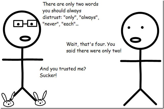
There are only two words you should never believe: “only” and “never”.

Oh, and “always”. And “every”, “each”, “none”…Yeah, that’s more than two. You didn’t believe “only”, did you? Never do that!

Only and Always

Whenever the stakeholders tell you an absolute, don’t believe them. Challenge them on it. Make them prove it. Make them defend it. Make them put it in writing.

Or if it’s not the right time to be challenging them, make a note of it; and then later, come back and challenge them and make them defend it and prove it and put it in writing.

To programmers, absolutes like these are mathematical statements:

  • Only == 1 (or 2, or whatever follows “Only”)
  • Never == 0
  • Always == 1..*
  • Every == 1..*
  • Each == 1..*
  • None == 0

And so on. But to stakeholders, as my buddy Curtis Gray says, absolutes are figures of speech, meaning “mostly” or “seldom” or “as far as I can recall”.

So developers need to nail down these assumptions. Probe and question to determine whether these are really absolutes, or only general rules. Assuming that they’re absolutes can be a major cause of unforeseen bugs. “But they told us they would never do that!” Well, they did it. The code’s broken. Everyone’s unhappy. All because you weren’t just a little more persistent during the requirements analysis stage.

In terms of UML, this commonly comes into play with multiplicity, the range of possible participants in a relationship. This can be stated as a number, a set of numbers, a range of numbers, or any combination of the above; but most commonly, you’ll see:

  • 0..1
  • 1
  • *
  • 0..*
  • 1..*

In UML-speak, * stands for what mathematicians and others have commonly called n: an unspecified quantity. So if a publisher, for example, tells me that a book has 1 or more chapters and some number of authors, each of whom may be an author of multiple books, I’ll draw this picture:

Book (Version 1)

But I won’t stop there. I’ll use this diagram to start asking questions, and responding to answers:

  • Does a book ever have zero authors? No. Even if it’s just a compendium, we list the compiler as an author. OK, then let’s be explicit: it’s 1..* authors, because there’s never 0.
  • Does an author ever have zero books? Yes, because these are our published books. Some of the authors we work with, haven’t published yet. OK, then let’s be explicit: it’s 0..* books, because there’s a chance of 0.
  • Can a chapter ever be in more than 1 book? Wellllll… Yes, and no. Sometimes we make a combined volume out of two previous volumes, and the chapter then appears twice. So do you consider that the same chapter in two books, or two identical chapters? Oh, no, they’re not identical. We usually do some clean-up and additions on these combined volumes, to entice people who have the originals. Ah, if they’re not even identical, then they’re definitely two chapters, not one chapter in two books? Yep. OK, let’s leave that at 1.
  • Can a book ever have 0 chapters? No, of course not. Are you sure? What about a book without any formal chapter structure? We still organize that as a single chapter. What about a book where you haven’t received any chapters from the authors yet? Oh, wait a minute, you said these were only published books. That’s right. OK, then we’ll leave this at 1..*.

Then I would redraw the picture just slightly to reflect what I learned:

Book2

I would use the diagram both to capture information and to promote further conversation. Never just draw what you “know”. And never accept an absolute at face value!